Design Foundations
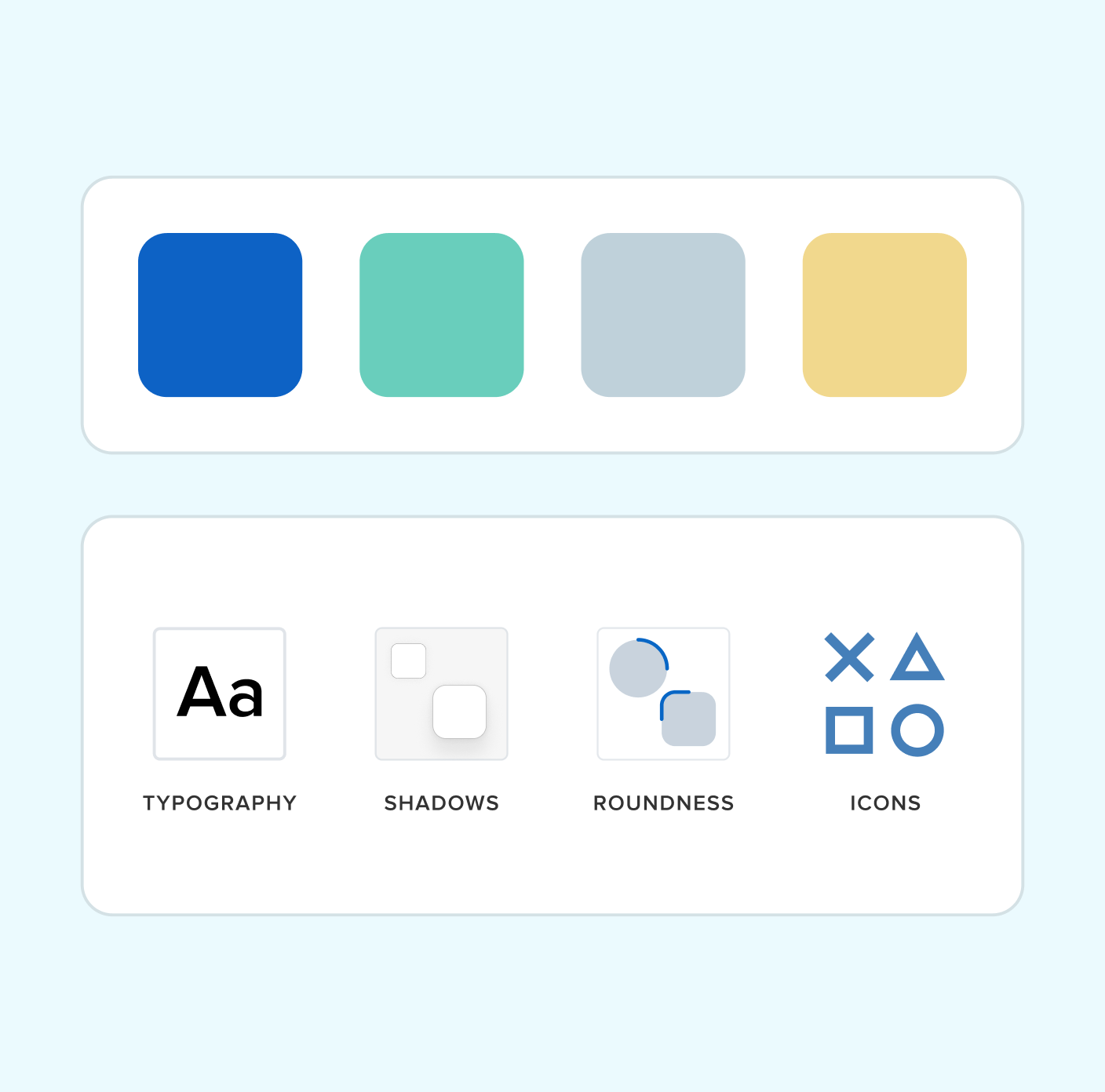
Your product's visual language: colors, typography, spacing, icons, grids, and design tokens for consistency.

Trusted by Startups to Global Enterprises.




Your product's visual language: colors, typography, spacing, icons, grids, and design tokens for consistency.
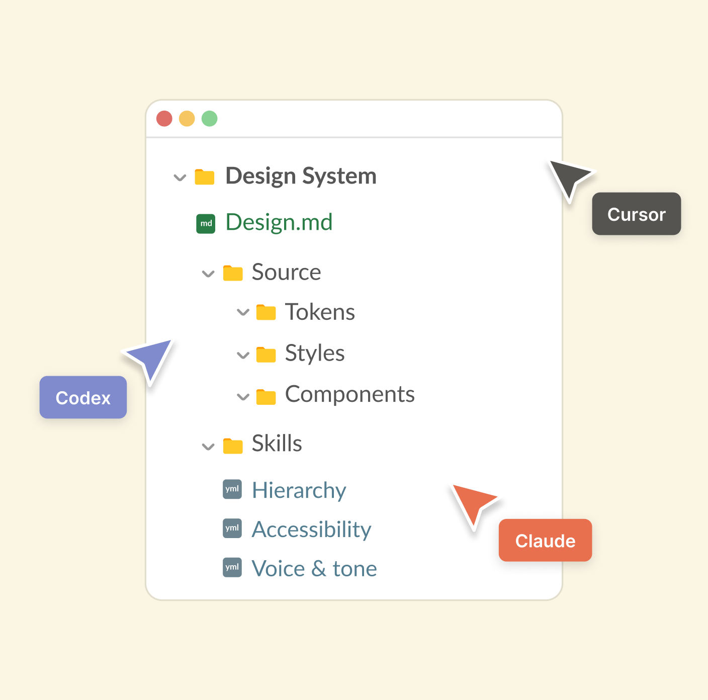
Streamline your design systems to enable AI tools to generate consistent user interfaces effortlessly.
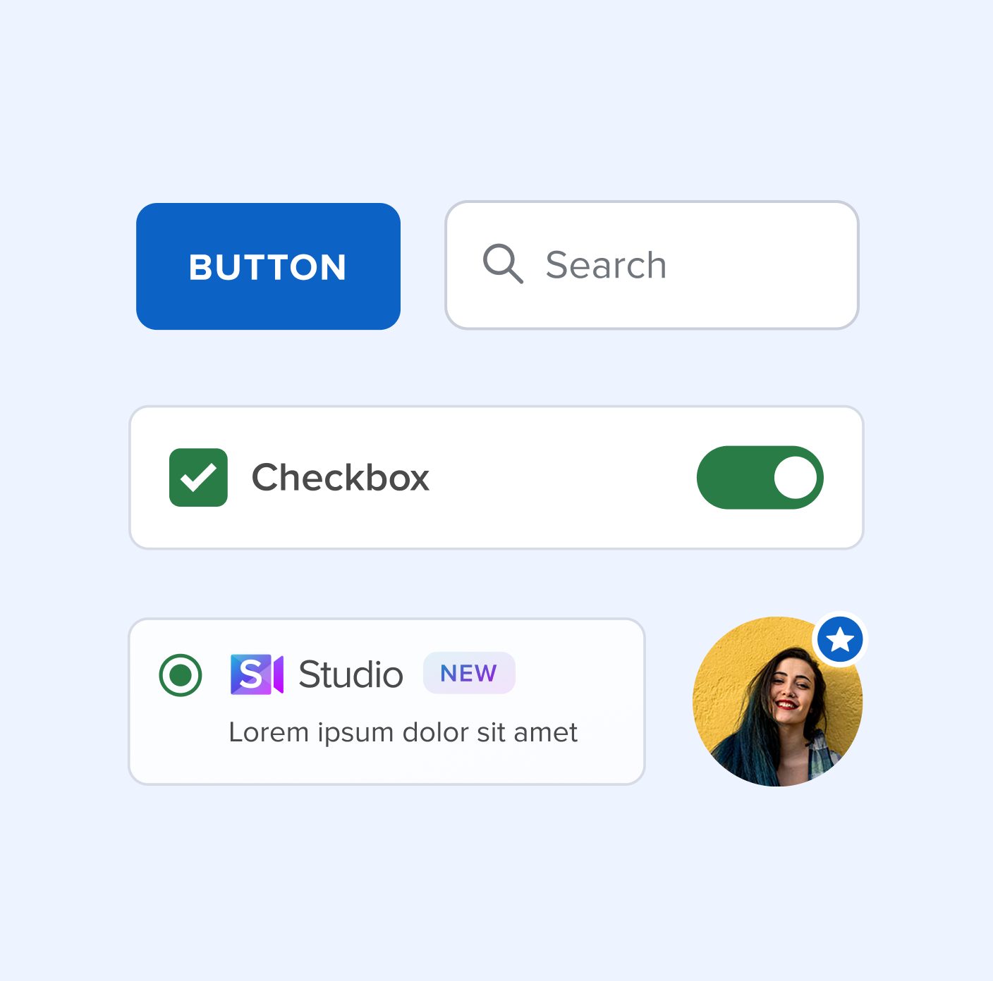
Library of UI components that help teams design products faster and maintain consistency.
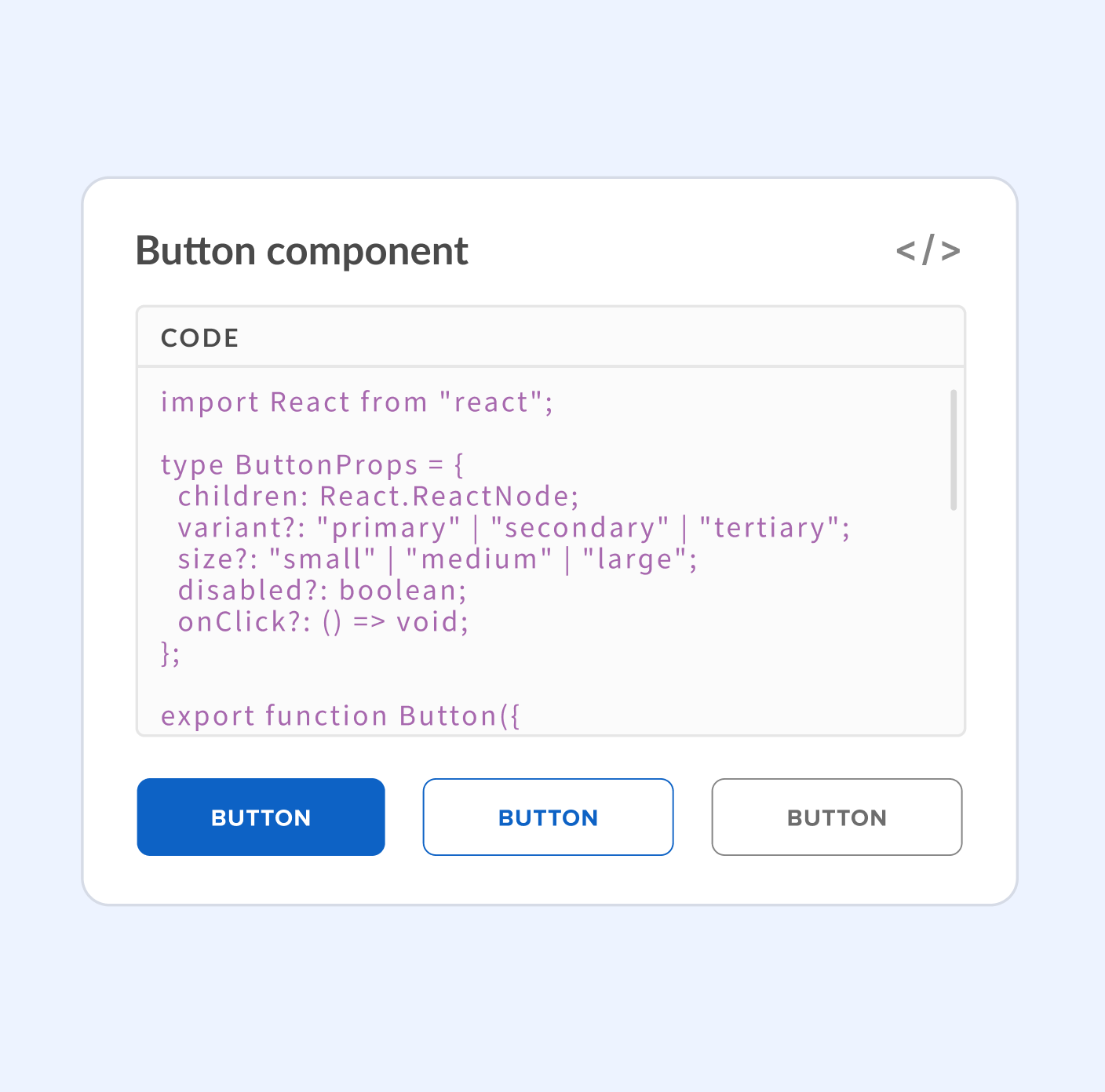
Front-end components for seamless integration, built with React, Vue, and Web Components.
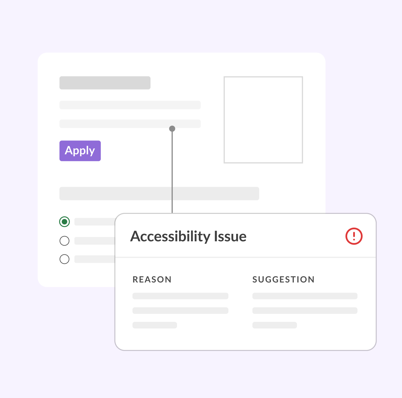
Assess products for inconsistencies and accessibility issues, then plan a scalable design system.
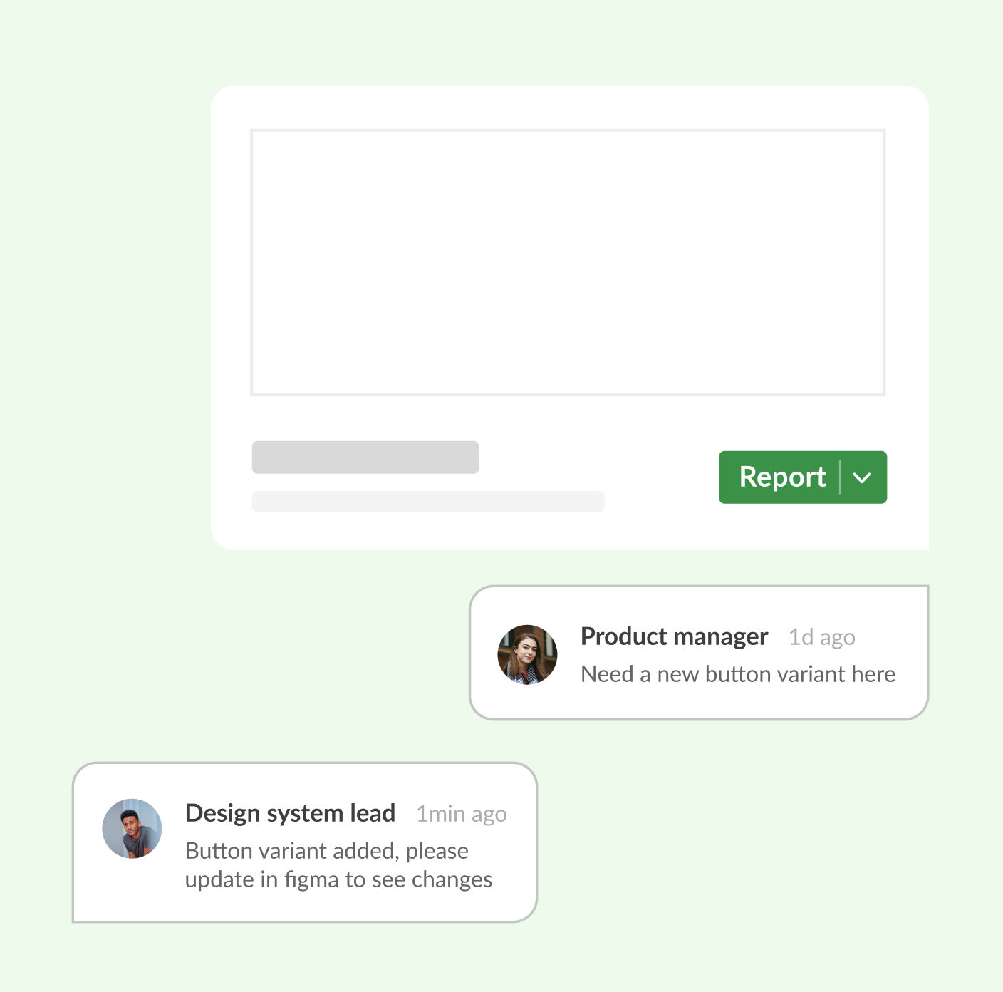
Update the design system with new components, reviews, training, and support as products grow.
Your product's visual language: colors, typography, spacing, icons, grids, and design tokens for consistency.
Streamline your design systems to enable AI tools to generate consistent user interfaces effortlessly.
Library of UI components that help teams design products faster and maintain consistency.
Front-end components for seamless integration, built with React, Vue, and Web Components.
Assess products for inconsistencies and accessibility issues, then plan a scalable design system.
Update the design system with new components, reviews, training, and support as products grow.
We partner with beginners, old-schoolers and game-changers across industries to create design solutions with an impact.
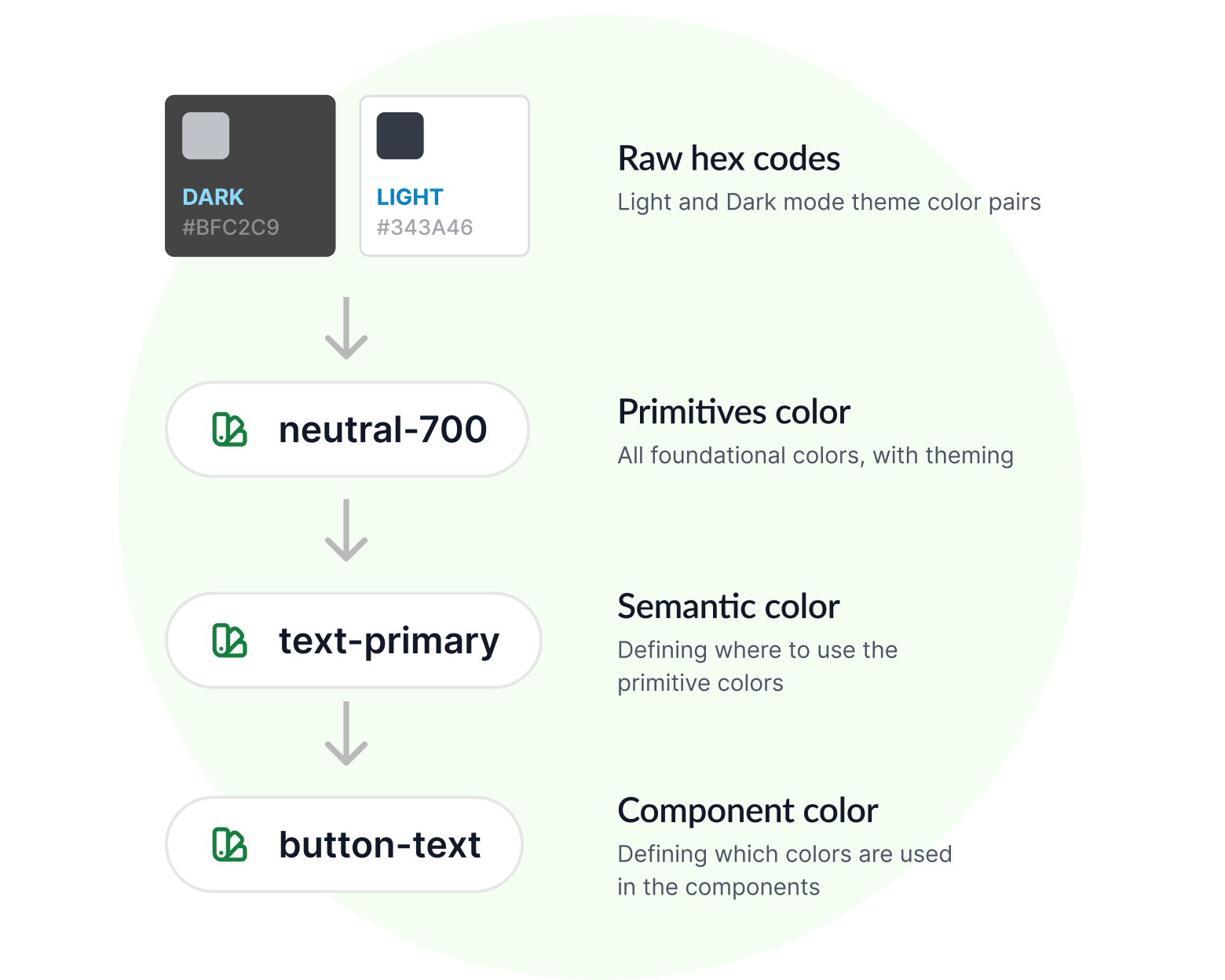
We use semantic tokens at three levels: primitive colors are the base colors with light and dark theme support, semantic colors derive from this and provide meanings by describing purpose based names, and component colors derive from the semantic alias to describe which tokens each component should uses.
This approach helps AI interpret and use design tokens for a coherent user interface.
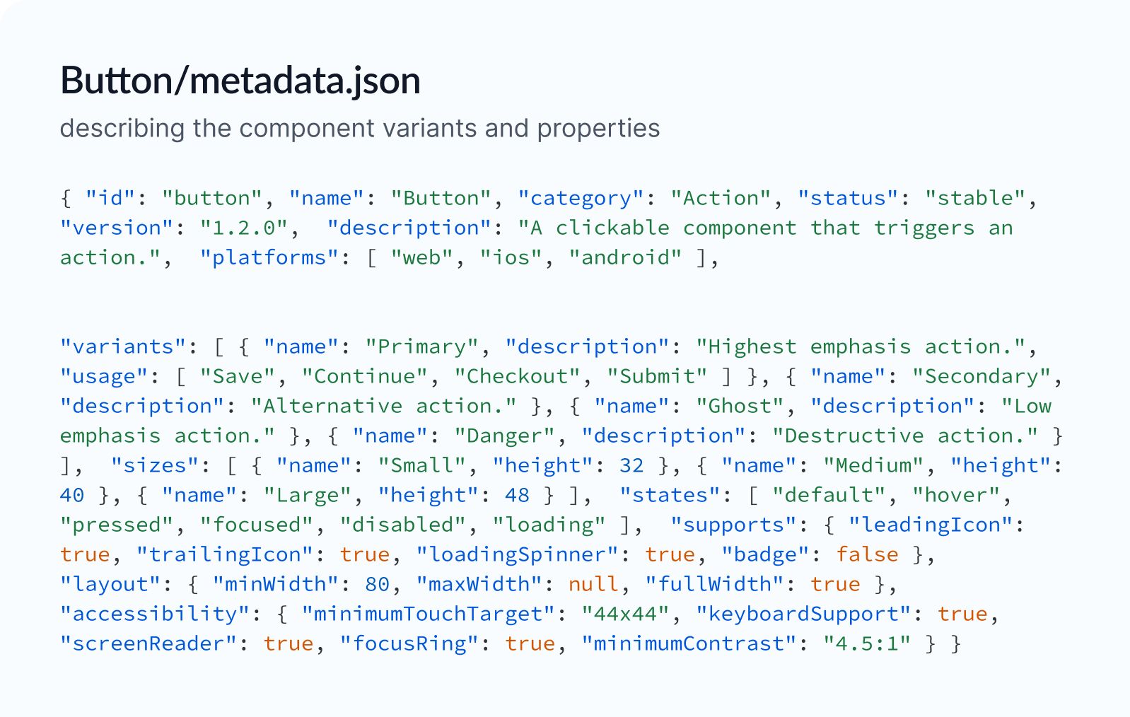
Searchable metadata for AI, RAG, and documentation systems, describing the component variants and properties
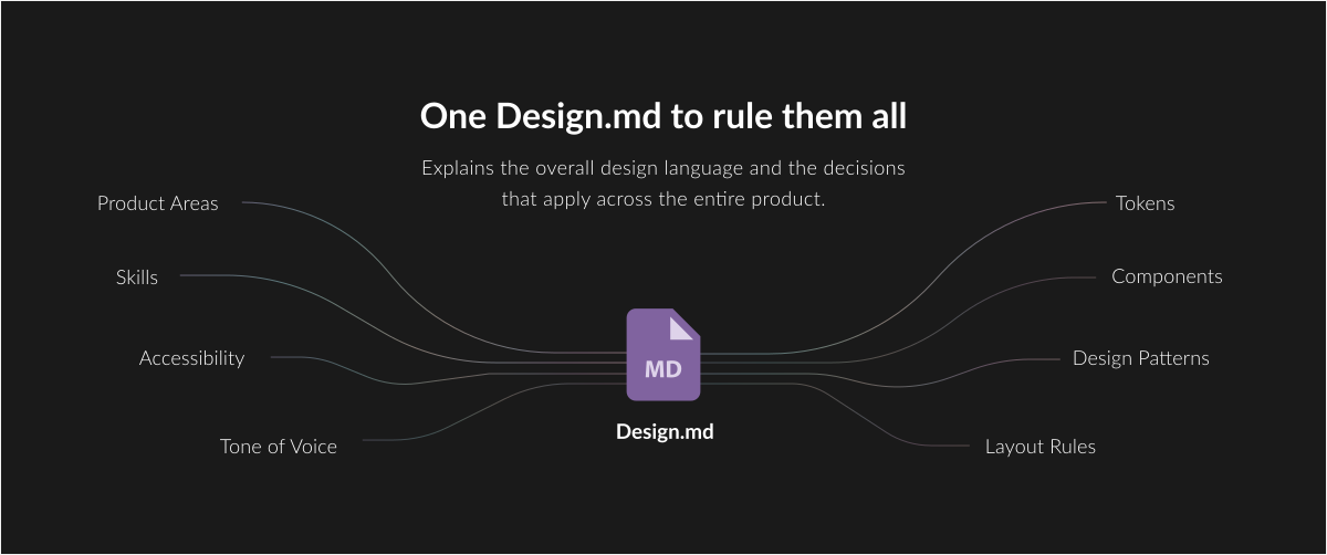
Each component has a rules.md file with guidelines on purpose, variants, and usage for AI context.
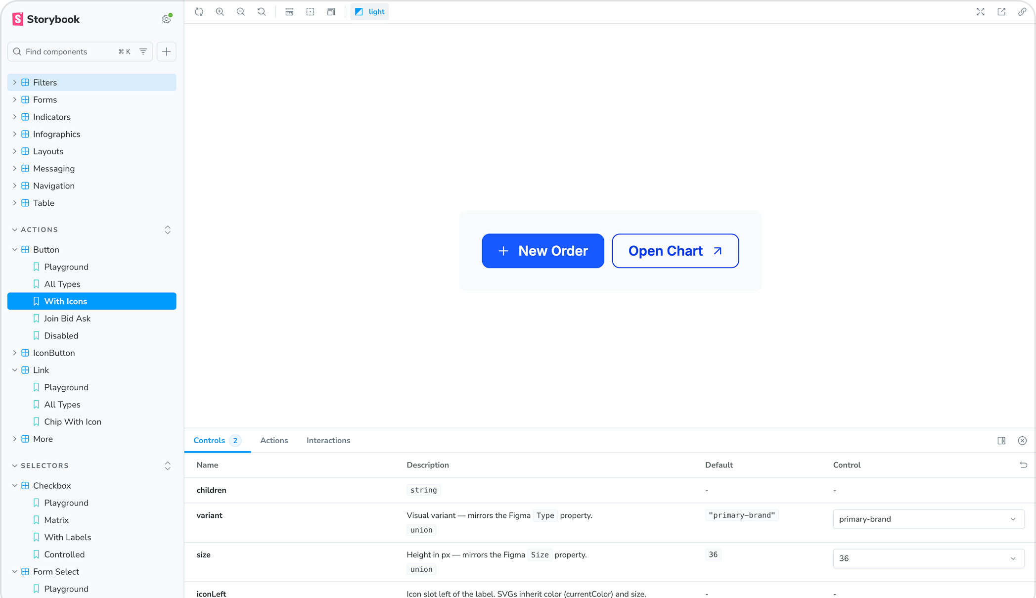
View your design system as a storybook with dedicated pages for each component

Thorough audit on your platform for inconsistencies and accessibility issues

We recreate few core screens to gain insights into the specific design system requirements your product needs.
Colors, typography, iconography, and other core elements of your brand standardized and made ready for the design system
Meticulously creating each component following atomic design principles and following accessibility rules

How to use the components in specific flows, product area specific component groups, design decisions and usage rules.
Careful documentation of purpose, where to use, do's and don'ts of each components in AI understandable formats

Consolidating all elements, structuring files for clarity, conducting quality assurance, and facilitating walkthrough calls and demonstrations.
Choose from any of the below engagement models
Traditional design system made in Figma for designers with atomic design principles
Ideal for
 Figma only
Includes
A fully front end focused design system, all components and rules live in code.
Ideal for
 Claude
 Codex
Codex Cursor
Includes
Complete figma design system ready for vibe designing with Figma make.
Ideal for
Figma Make
MakeIncludes