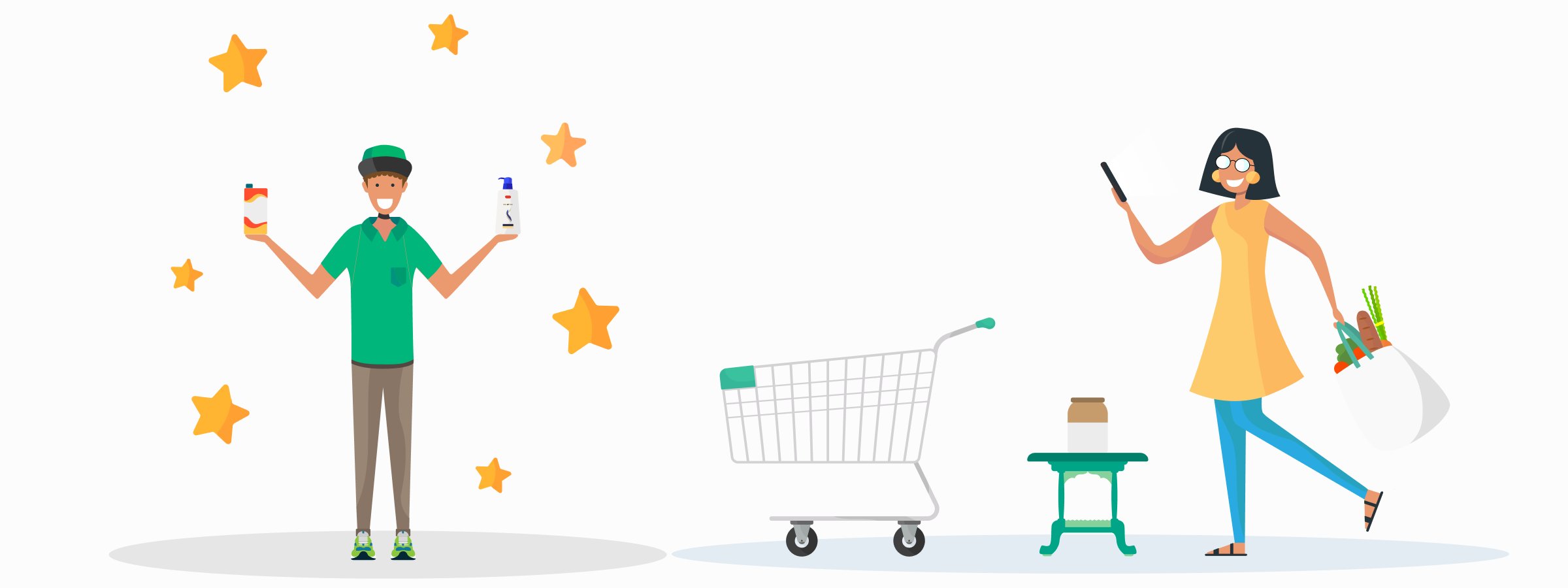
Improving the online grocery shopping experience
Brief
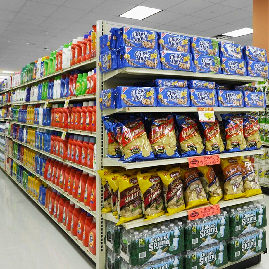
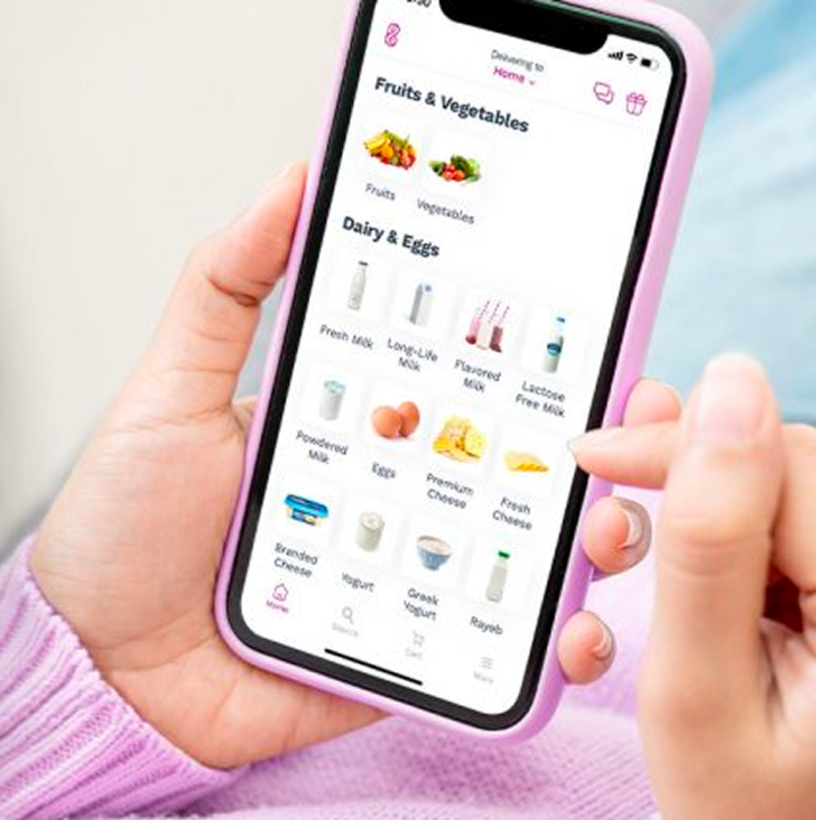
In the competitive space of door-step grocery delivery, our client offered an online grocery shopping experience that stands out with its focus on efficiency and offering the best value to its customers. With a goal to establish themselves as a serious competitor in the e-commerce space, they sought to enhance their mobile app experience to boost conversion, retention and customer satisfaction.
Our brief was to examine the current app experience for existing and new customers and identify areas for improvement. This was an exploratory project, whose outcomes informed the client’s product strategy and roadmap.
User Research
Product Strategy
Usability Testing
Ideation
E-Commerce
Approach
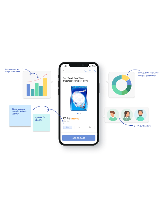
In our research phase, we gathered a lot of data that we refined and validated as we went along. These insights resulted in 17 key areas for improvement. Throughout the process, we worked closely with the client– learning, sharing and ensuring our research aligned with their goals.
The research had two main parts: understanding our users and improving the E-commerce app. To grasp who we were designing for and their needs, challenges, and attitudes, we did generative research. Talking to users of other apps and even some offline shoppers helped identify opportunities and gaps in the app. Then, with evaluative research, we zoomed in on E-commerce based grocery shopping app, pinpointing obstacles and opportunities for improvement.
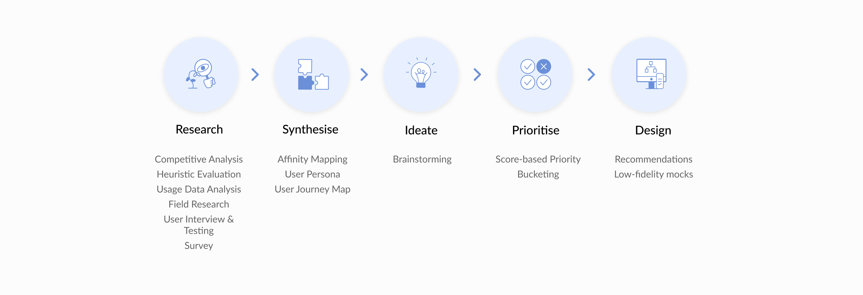
Step 1 : Research for deep understanding
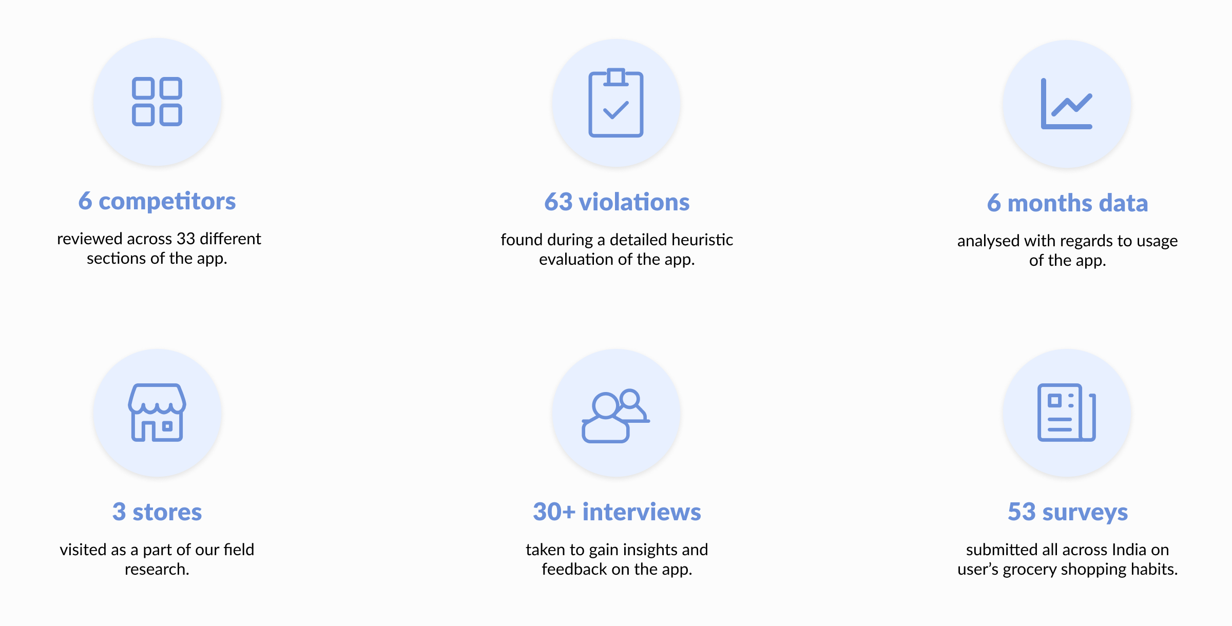
We used 6 different methods (qualitative and quantitative), to conduct our research and build a holistic understanding of the users and app usage.
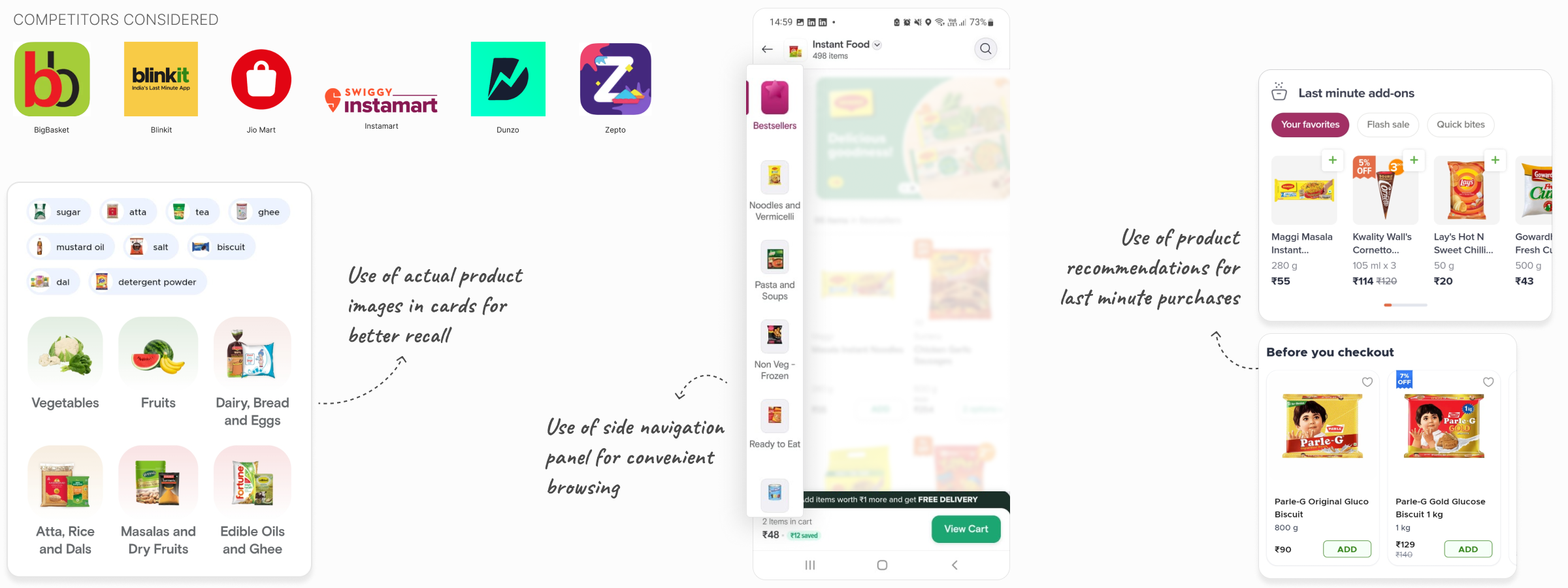
Competitive analysis to understand market & peers
We studied 5-6 competitors, including both direct and indirect ones. Our focus was on understanding their features, task flows, interaction patterns, visual design, approach to curation and personalization. This analysis revealed what competitors offered, who their target audience was and how they addressed their users' needs.
Few high-level takeaways:
- Instant and Next-day delivery apps differ greatly in their design and offerings, reflecting the distinct use cases they cater to (urgent vs planned shopping).
- Most apps follow common interaction patterns, ensuring a familiar experience and low learning curve for new users.
- Strong visual identity plays a significant role in setting Apps apart and influencing user preferences.role in setting Apps apart and influencing user preferences.
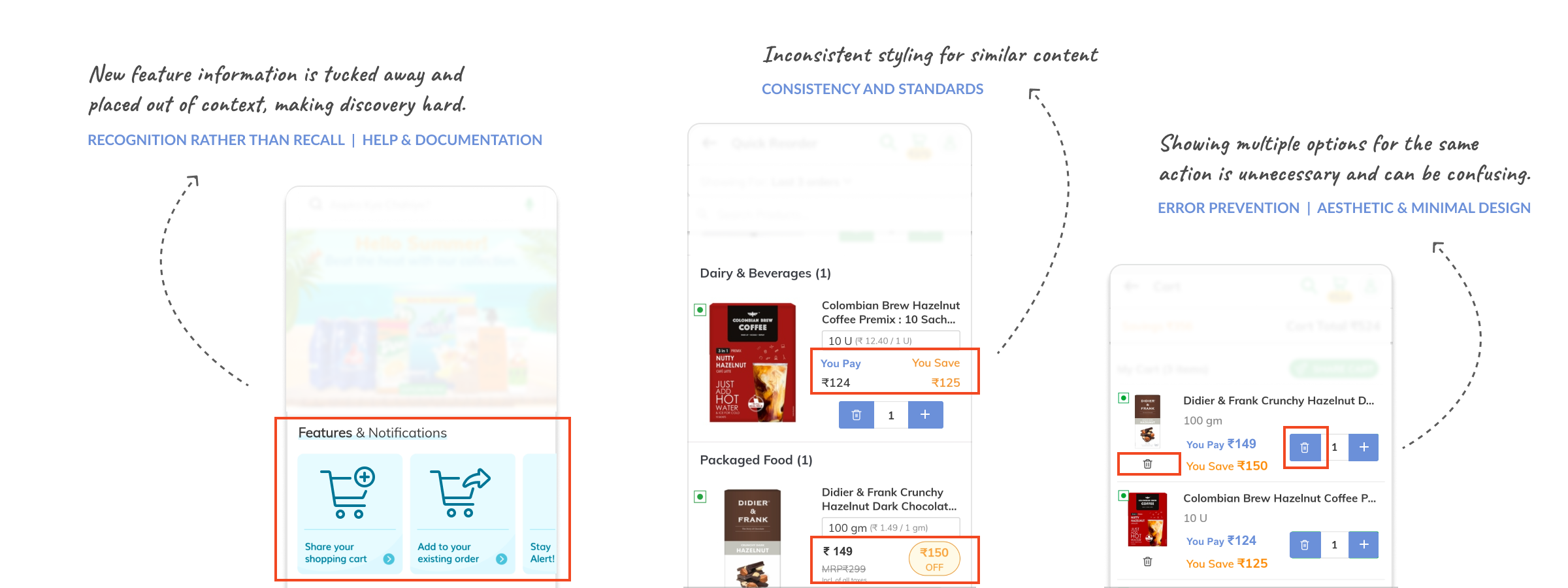
Heuristic evaluation to assess existing app
By assessing the android app against 10 heuristic principles, we uncovered 63 violations that might be obstacles or pain points for users. Fixing these were identified as quick-wins for improving usability of the app.
Few key findings:
- Most common issues were around consistency, relevance & hierarchy of information and clarity of system status.
- Very often information was shown repeatedly and out of context.
- Lack of consistent design language and style.
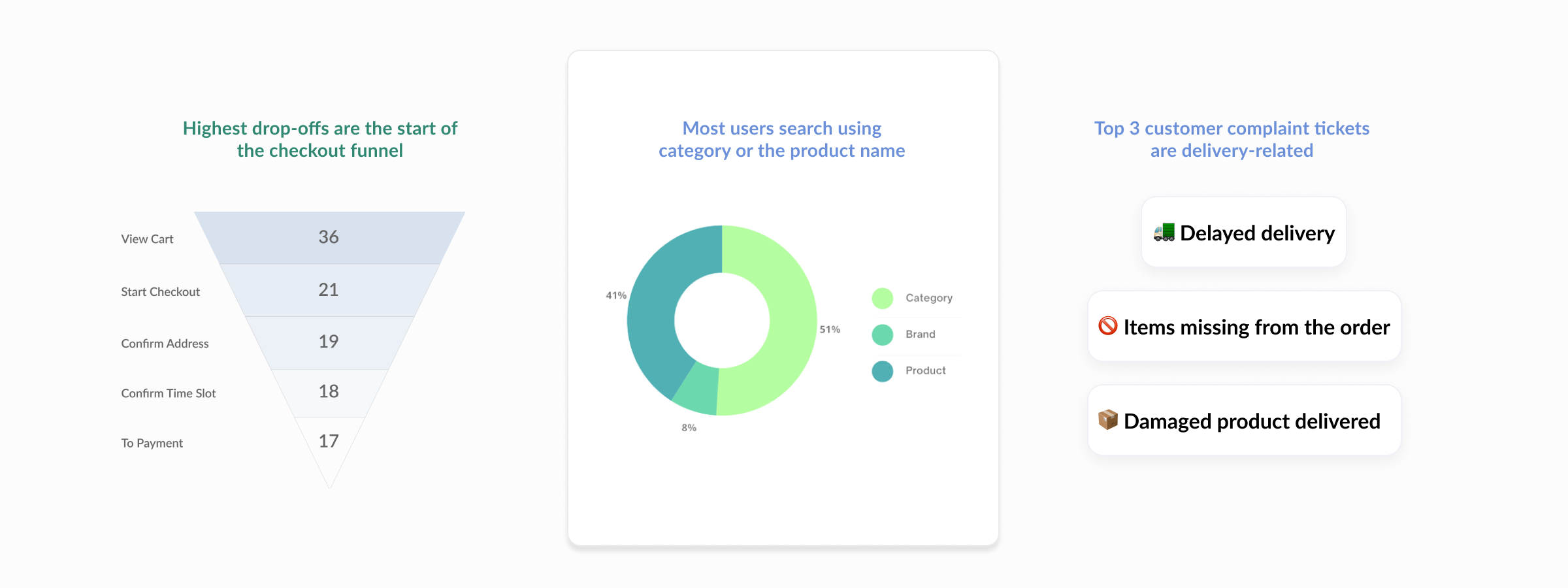
Analysis of existing data to uncover usage patterns
Through examining the current usage data of the E-commerce app, we identified areas to dig deeper into during user interviews and surveys. The data revealed drop-off points in the funnel and highlighted popular areas for adding items to carts. Understanding the ‘why’ behind this data gave our qualitative research further focus.
Few key findings:
- More than half of the customer complaints were related to current order delivery.
- Drop-offs in the checkout funnel differed between new and existing users, and this was a good direction to investigate further.
- Search and Add-to-cart behavior of users was evident through the data.
Field research to observe user behaviour
The E-commerce based grocery shopping app provides customers with the convenience of home delivery and pick-up point options. To gain insights into shoppers' grocery pick-up behaviors and preferences, we conducted on-site visits to the Pick-up point stores. Here we observed customers and interacted with the store managers.
Some of our key observations were:
- Shoppers switched between multiple methods of delivery based on their situation, and did not always stick to one method.
- Most walk-in customers were unfamiliar with the pick-up point concept, which the store manager would explain and assist with.
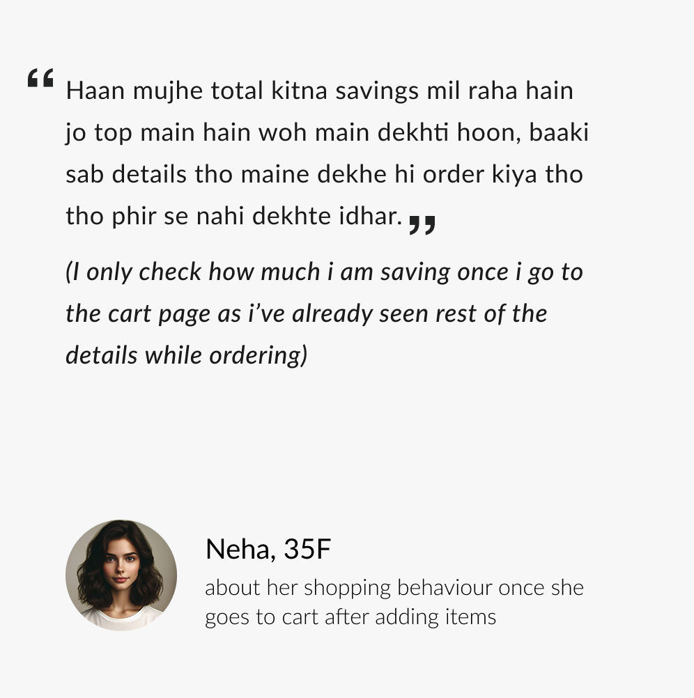
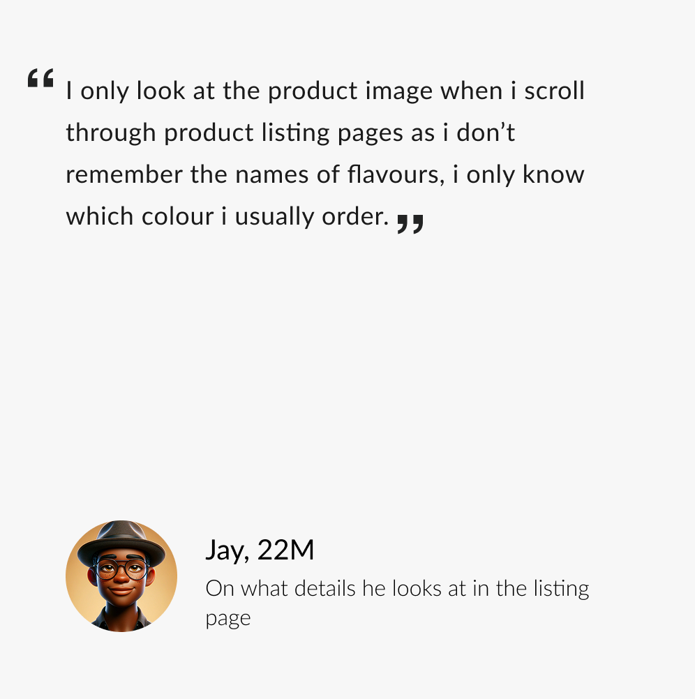
User interviews to understand user needs
We interviewed 30+ online grocery shoppers, including the E-commerce based grocery shopping app and users of other apps. This gave us insights into general online shopping behaviors. The user interviews helped us understand the ‘whys’ behind app data and discover what worked or didn't.


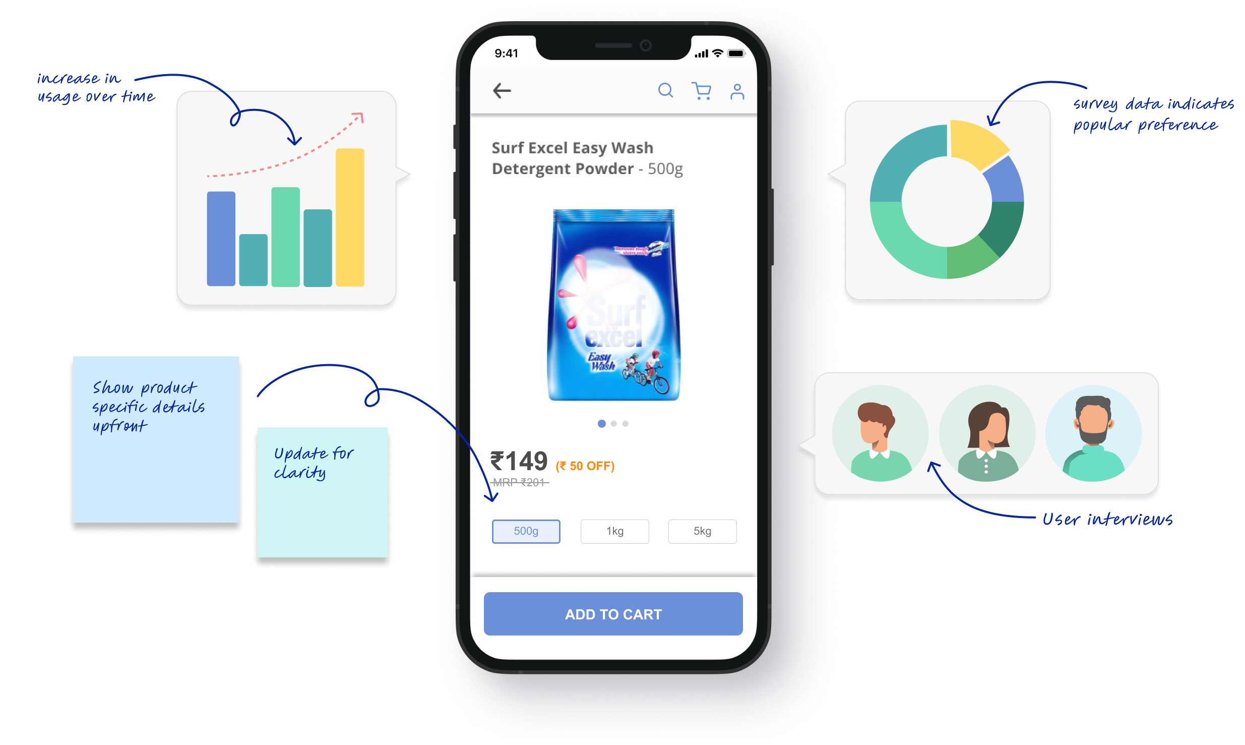
Usability testing & concept validation to verify and fine-tune ideas
Rather than just hear how people use the app, we observed them using it which gave us deeper insights into real user behaviour. Users were asked to complete 2 tasks on the app, allowing us to observe unconscious shopping behaviours and identify usability issues.
Based on ongoing research, we also created concepts to improve the shopping experience. Users were shown low-fidelity mockups of these to gather feedback and validate ideas.
Some of our key observations were:
- 92% of users did not scroll more than twice on a page. They navigated elsewhere if they didn’t find what they were looking for.
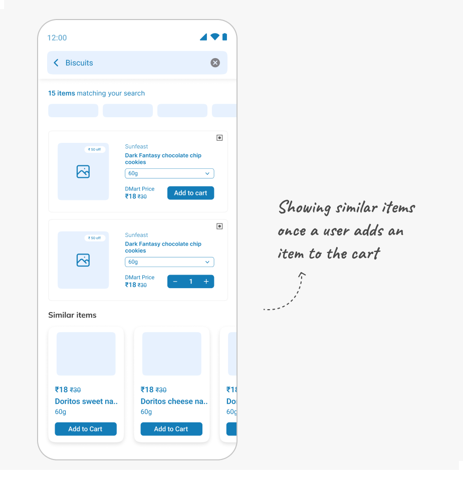
- Most shoppers liked looking at options for products they purchased to see if alternatives were more attractive, interesting or of better value.
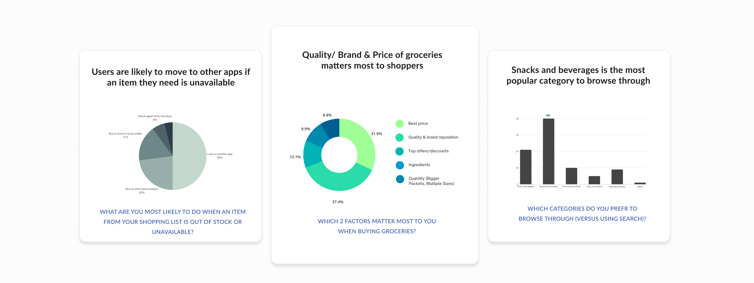
Surveys for quantitative data to back up findings
We circulated a survey with the aim of validating some of our findings from the user interviews. This qualitative data was valuable in backing up our findings and revealing new ones.
Few of our validated learnings were:
- Shoppers regularly make repeat purchases of a few products due to taste and quality preferences.
- Factors behind a shopper’s decision-making is based on the category of product and the need they are trying to fulfil.
Step 2 : Synthesis to make sense of data
We grouped the findings from our research logically such that themes and patterns began to emerge. These were refined further to develop key insights. Some of these were around decision-making, repeat purchases etc. We developed 3 personas based on the distinct user types and traits. We also created user journey maps for new and existing users, mapping out their entire end-to-end experience. This activity revealed opportunities for improvement and innovation.
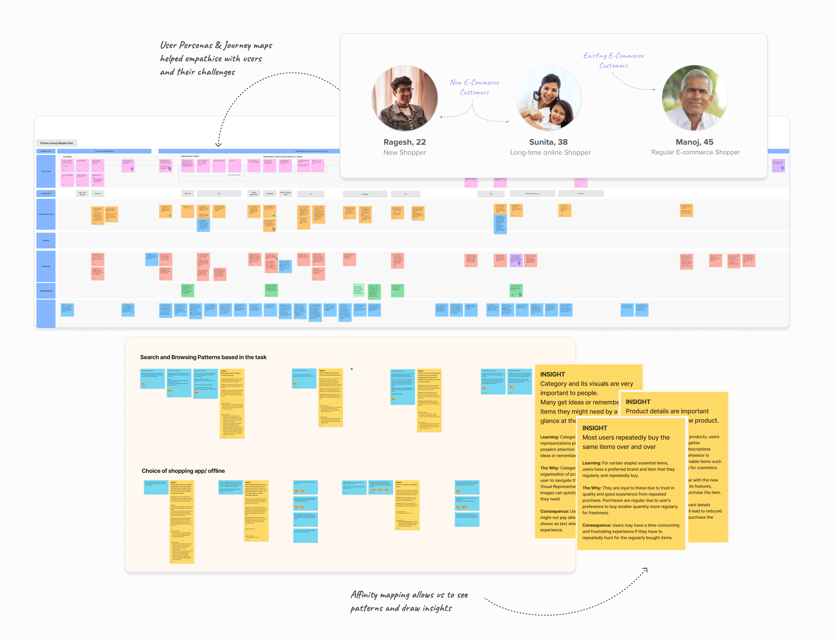
Users are loyal to these brands due to trust in quality and good experience from repeated purchase. These are purchased regularly due to a user’s preference to buy smaller quantity more regularly for freshness.
Users engage in browsing when they have a general item in mind but want to know about the variety available or explore the new options within that item.

When users don’t have a specific item in mind, they may experience decision paralysis when faced with a wide range of options. Prompts within the app force them to make decisions and guide them to items that they have a higher probability of buying.
Users are influenced by these recommendations in the cart (Especially during this part of their shopping journey) and are more likely to add additional items to their cart based on their preferences.
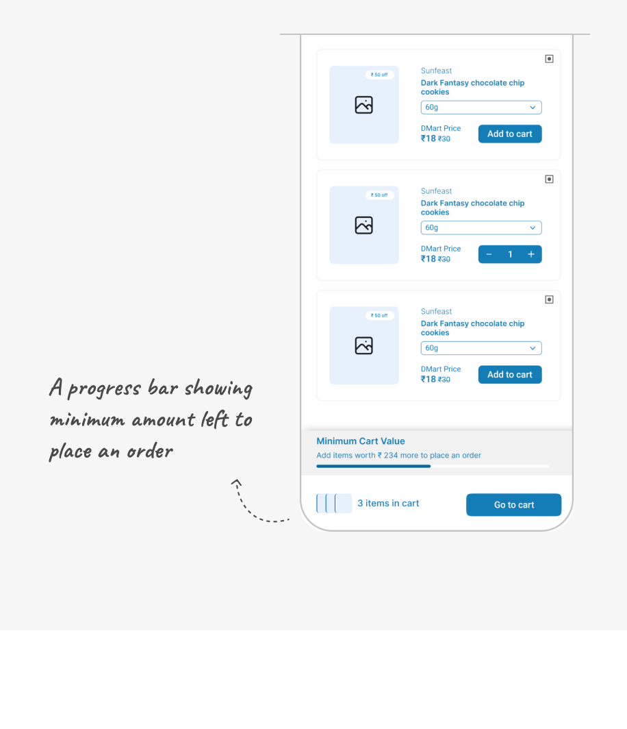
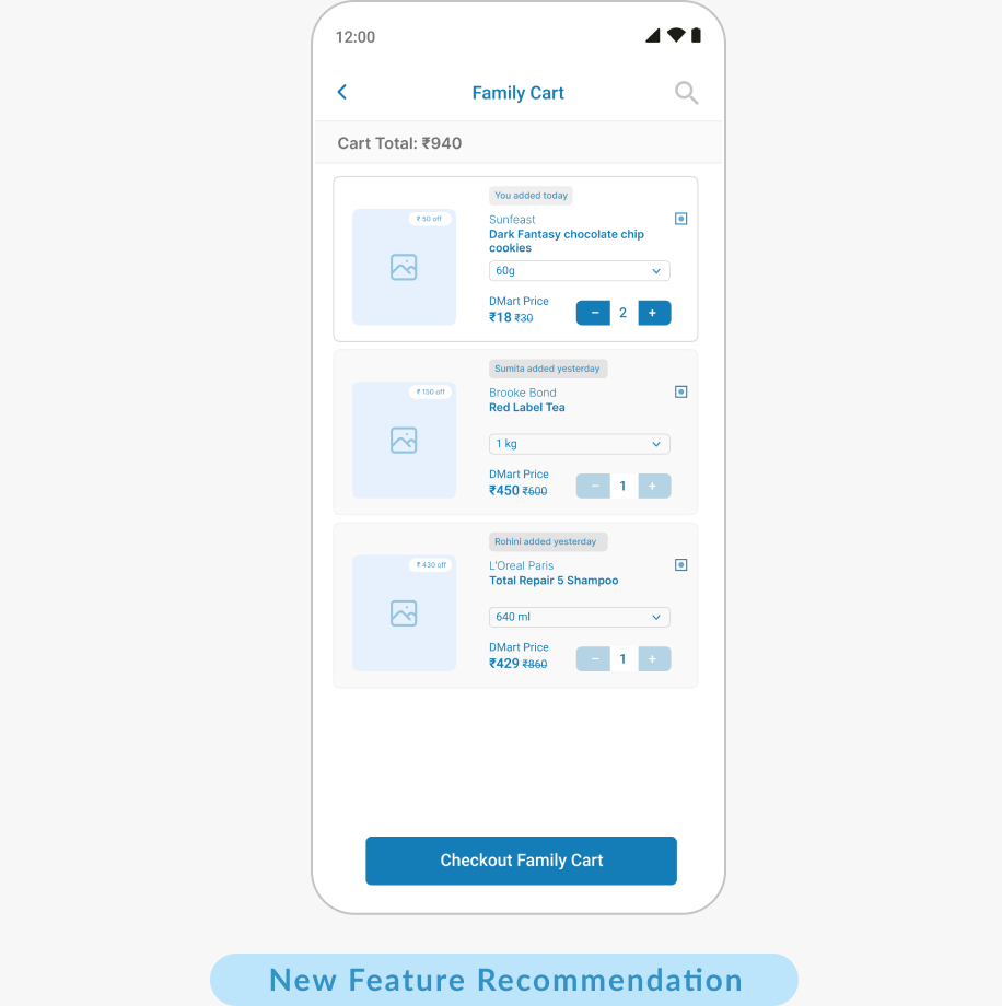
Placing a single order for the entire family allows users to reach the minimum delivery limit faster. Payment, tracking and receiving the order is also handled by one person freeing up others.
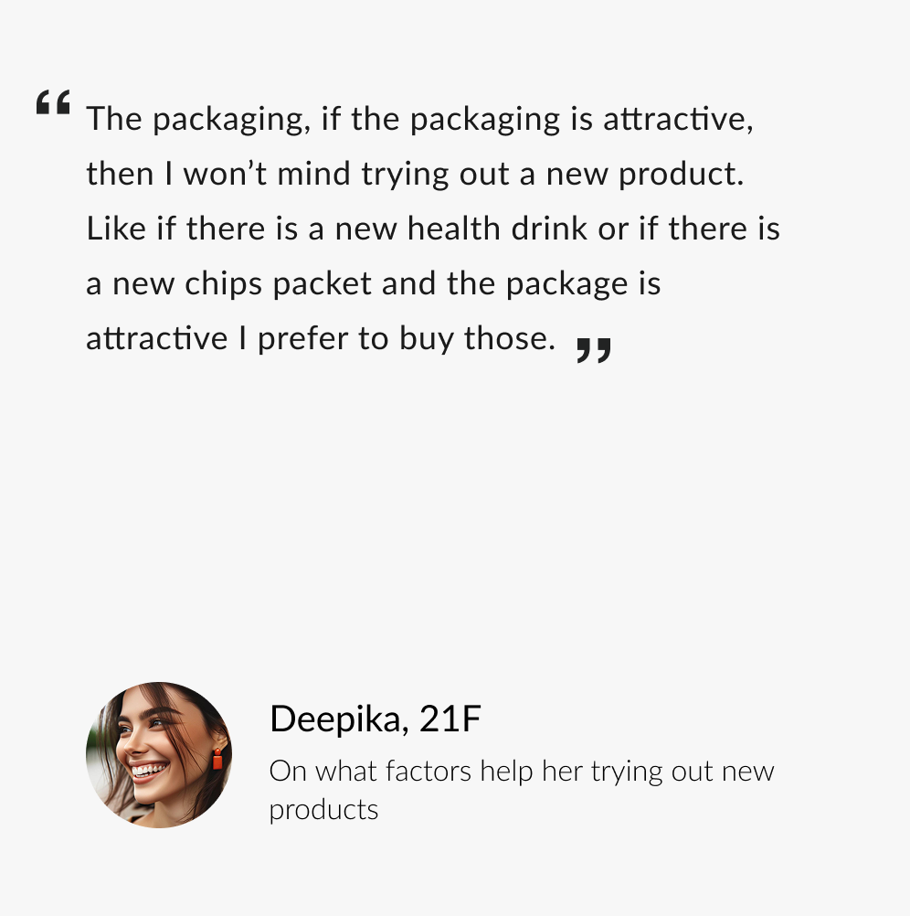
Well-designed packaging creates a perception of high-quality and users often associate attractive packaging with better quality making them more inclined to buy the product.
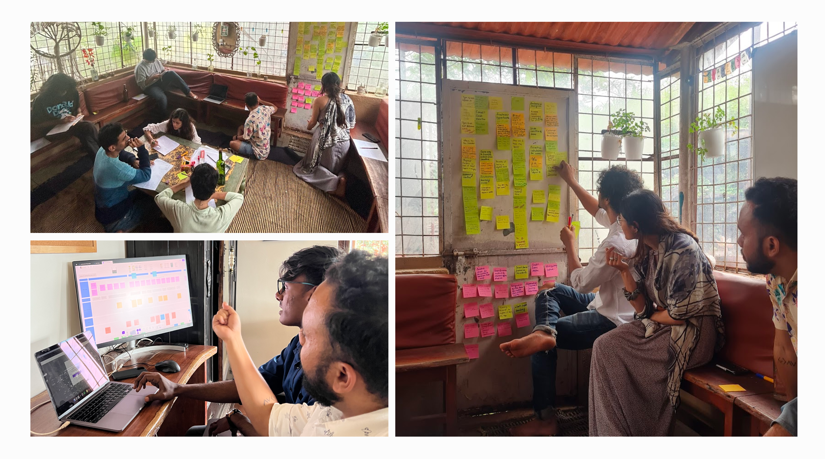
Step 3 : Sparking ideas through brainstorming
We brainstormed solutions and innovative ideas to address identified gaps in the app, aiming for a competitive edge. These were done online and offline using a variety of tools. All the ideas were further refined into 17 final areas of improvements.
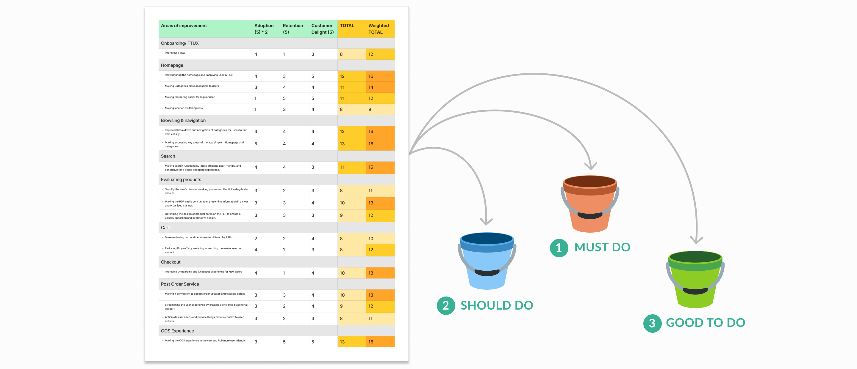
Step 4 : Prioritising improvements
The areas of improvement were prioritised to help the client plan them for the product roadmap. We used a score-based prioritisation method where each area of improvement was given a score based on 3 factors– Adoption, Retention and Customer Delight. Adoption was given higher weightage due to the focus of the project. Based on the score, the improvements were categorised into Must dos (Priority 1), Should dos (Priority 2) and Good to dos (Priority 3).
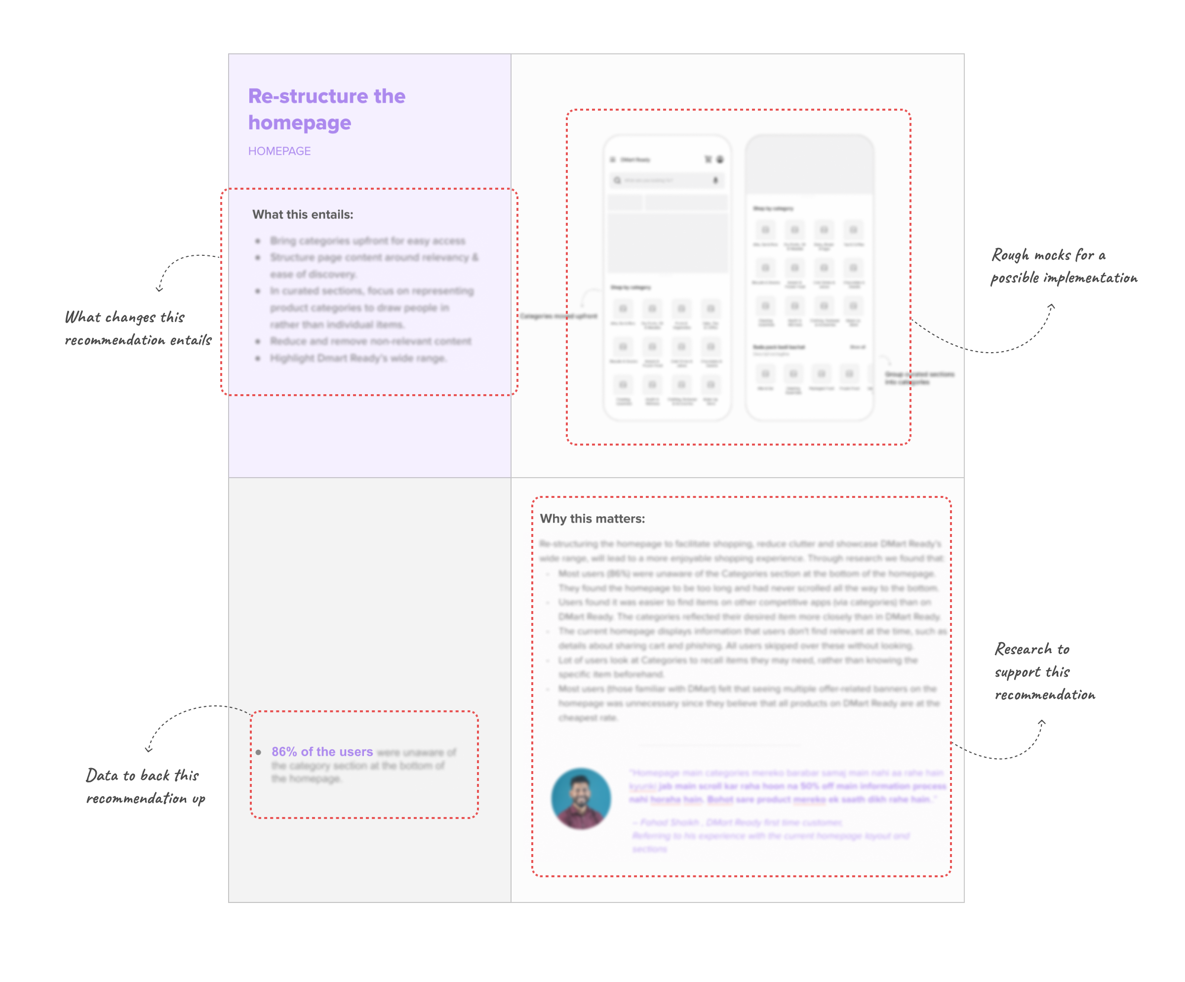
Recommendation outcomes
The 17 key areas of improvement were presented in a compelling and shareable format. Each was backed by our research findings, making it easily digestible and actionable for stakeholders.
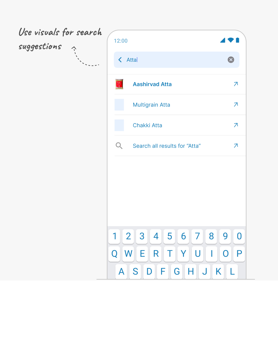
- Use visuals & product images to aid in recall
- Suggest tags/ category/ brands for more focused & relevant search
- Handle error scenarios better, without breaking flow and bring search upfront in PLP to reduce navigation
- Offer action to re-order items upfront and in-context
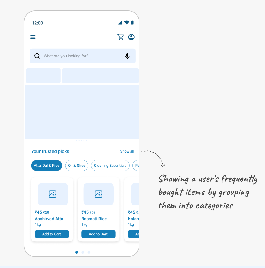
- Intelligently prioritise items based on essentials, value and repeatedly bought
- Make adding delivery address easier and faster
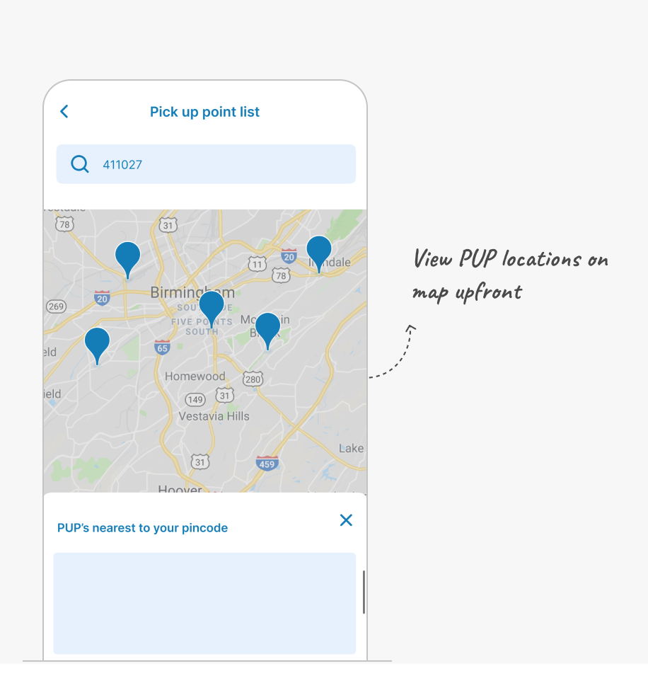
- Ease PUP selection process for unfamiliar localities (keyword search, view all on map etc)
- Make adding delivery address easier and faster
- Ease PUP selection process for unfamiliar localities (keyword search, view all on map etc)
- Present product suggestions at relevant points in-context to ease shopping and navigation
- Areas which will aid users: Cart, Product listing page, Product detail page etc
- Create a common account that can be used by family members, housemates etc. to browse and add items to a common cart.
- Real-time cart to enable people to add and review items before a single person performs checkout.
- Allow all individuals to track status of order from common account.
- Common account separate from personal account.
Impact
The outcomes of the project were used to guide the client’s product strategy and roadmap. It successfully validated certain assumptions shared by our team and the client, but also endorsed planned improvements. Our research was valuable in providing a clear design direction for these improvements to have a successful outcome.